1. Weapon Materials
In BLISTER we want to have a huge array of guns. There’s quite a few already (21 guns!) and we began to notice that the way we handled the materials for the guns was starting to take up a lot of storage space. They had very high resolution textures, with one, absolute material made up of a bunch of really high resolution textures.
In-game this looks fine, but it’s really inefficient storage-wise as well as taking up a lot of space in the texture pool, and no only because we were stupid enough to not pack the reflection maps. More than this however, we wanted to more easily control the look of the guns iteratively.
With the old system, we’d have to open up the material again in Quixel, make the changes we wanted and then re-export and re-import in order to preview them in-engine. This was time consuming as shit.
Figure 1 The old material "system" aka: Bollocks
We decided to go about creating a new system for texturing our weapons, using the KRISS Vector as a testbed for this. The aim was to have a material system that combines baked normal and ambient occlusion with tiling materials.
The normal and AO are applied to the model as normal, but the rest of the texture is from detailed tiling materials that we have many exposed parameters for. It can’t just be a single tiled material though since we’d have no interesting detail like wear on edge and in cavities, so the system must use two tiling materials with one masked out to appear only on places that wear is appropriate.
Here’s the completed master material we ended up with, as always with materials it’s far less complicated than it appears.
Figure 2 New material system, definitely still needs improvement
Let's break it down:
First thing you notice is there’s a lot of parameters, both scalar and 2D. This block is for the main tiling material, for a gun it’s usually some kind of painted metal or plastic, so we have the albedo in its own texture “MainMaterialAlbedo”.
This is then multiplied by “MainMaterialColour” which is set in the material instance so we can alter the colour of the main tiling material. The TexCoord/Multiply is for setting the scale of the main material. The “MainMaterialRM” (RM stands for Roughness/Metallic) is the two maps within the red and green channels respectively.
These both use a Blend_Screen node to control the brightness, and the roughness uses a CheapContrast to be able to change the look of the material in how it reacts to light. So we can choose to make it less glossy, or have more contrast between the glossy and the matte parts for example.
All this is put into a MaterialAttributes which almost allows you to make a material within a material--this is useful for when we blend it all together later.
You can see the wear material is far less complex, but basically does the same stuff. We don’t really need a contrast for the roughness in this case just because the wear is never really visible enough for it to make a difference. Notice that nothing has been masked out yet, that’ll happen when we blend the materials together.
Here is where we blend the tiling materials together. The Base Material input is the MaterialAttributes of the Main Material, and the Top Material is the Wear Material’s MaterialAttributes.
The alpha is a mask we create in Quixel specific to the weapon, so the wear is only applied to the areas we want it to be. We also use a contrast node and a multiply node so that we can have some in-engine control over the strength of the mask.
Notice that we then have to break the result blended material so that we can then add in the normal map and ambient occlusion, since we blend those separately as to not lose any detail, you’ll see in the next section how we do that.
This one is a bit crazy, and the part that gave me the most headache. I’m sure there’s a better way but every other solution I found gave me different troubles (Including blend angle corrected normals). So here we have the normal map from the main tiling material, and the normal from the wear tiling material.
The problem is that if we just blend them together we lose a bunch of detail from mashing the blue channels together. So to strip out the blue channel of the wear material, we make a vector using the append nodes, (1,1,0). Multiplying the texture map by this basically clears the blue channel and then when we lerp between the two maps the blue channel just stays as it is.
The mask we use for the alpha is exactly the same as the one we use for the blending of the two materials. Now that we’ve got the tiling material normal blended together, we need to do the same thing for the mesh normal so we strip the blue channel of the normals we just blended together as before, and then just add the mesh normal and the blended normals together. This makes our final normal map that’s then plugged into the final material output.
There’s many ways of making this system, and loads of stuff that I’m sure could be done better, and features I’d like to add (Like more tiling materials in a single material for better variation) but so far it’s treated us very well and given us some really nice quick iteration and control when texturing our weapons.
Most of the weapons have about 2-4 material instances of this master material, for example one for plastic, one for metal, different colours etc. It also allows us to really quickly create new skins with almost no effort. Here you can see the final material for the KRISS Vector, using 4 material instances:
KRISS using 4 material instances
FN FAL using the same system with a new material, varnished wood
2. Blocking Out the Demo Level
Our intention is to drop the demo level on Steam before Christmas so that people can try it out, tell us what they like and what they don’t like. It will be the first time BLISTER is properly in the hands of people to play (and break), so it’s important for me in both a level design and environment design capacity to make the first level as fun and graphically arresting as possible.
It’s important to note that the first demo level is actually only 1/3rd of the entire level when it finally goes gold. This is because these levels are huge and we want to get as much feedback as possible before designing the rest of the level. Each level in BLISTER will have 3 separate wings to develop and carry out a plan in. The demo level contains 1 wing, but each wing is the size of an ordinary level in Rainbow Six: Athena Shield so if you’ve played a decent RS game before you’ll get an idea of just how big a finished level in our game will be.
BLISTER is heavy on the English Civil War references, so I thought it fitting to name our first demo level ‘Marston Moor Power Plant’, after the Battle of Marston Moor pitting King Charles’ forces against Oliver Cromwell’s.
Instead of marauding armies, you command 3 well-trained, heavily-armed specialist firearms officers versus a modern English terror cell hellbent on capturing critical infrastructure from the State. Your job is to eliminate the insurgent forces from within the power plant and rescue as many hostages as possible.
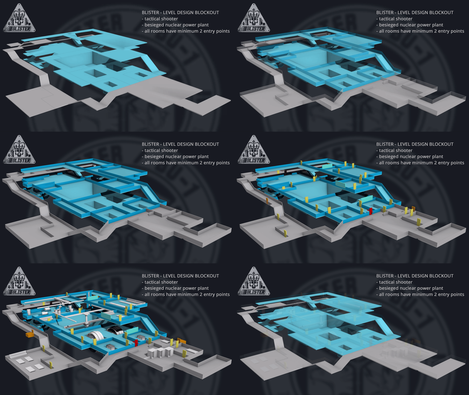
Before I entered UE4 to begin the greyboxing phase I planned out the level on paper and then recreated that plan in 3dsmax. This allowed me to visualise the flow of the level before I began constructing it. Planning it all out properly first meant the greybox phase only took a day to complete.
Before blocking out the level proper I had to set out a sizing standard for all shared properties:
- Walls: 4m height / 20cm depth with a 1m gap for piping, venting and drone access
- Doors: 2m height / 1m width to give AI enough room to manoeuvre
- Drone vents: 50cm height / 1m width to give the player’s drone an Elite Dangerous/letterbox-style opening
Corridor width, window height and so on is variegated, but the minimum allowed corridor size for AI to properly manoeuvre according to a drone plan is at least 2m width. If I wanted, I could build a couple of 1m-width floor-level vent access tunnels that only the player could fit through, either for secrets or gameplay decisions.
I had two considerations while developing both the 3D plan and the greyboxed level: to make each segment of the wing area look and play differently to its neighbour, and to make sure each room in the wing has at least two access points.
The result is an arrangement that a power plant designer might baulk at, but there is a lot of satisfaction in the varied geometry and navigational flow of each room to the next. It might be hard to visualise at the greybox phase but the screenshots below demonstrate the variation in the level design.
A turbine hall
A pipe flow area
A spent fuel pool
A control centre overlooking the waste fuel operation
During the greybox phase we tested the placement of doors, cover and obstacles to see what worked and what got in the way of gameplay.
The greybox is finished so now begins the tedious task of whiteboxing--that is, replacing the sparse BSP geometry with actual meshes that represent the final level without having to think about texturing just yet.
Next week’s devblog will probably discuss some changes to our FPS rig and an explanation of how our drone system can save time by loading in previous plans and tweaking them.
Cheers!
Regan & Bret
Item_42


